We helped Reckon implement a unified front-end platform and design system.
From design, to React, GraphQL, and team structure – we worked with the leadership team to create the organisation that designs and ships the next generation of Reckon products.
Services provided

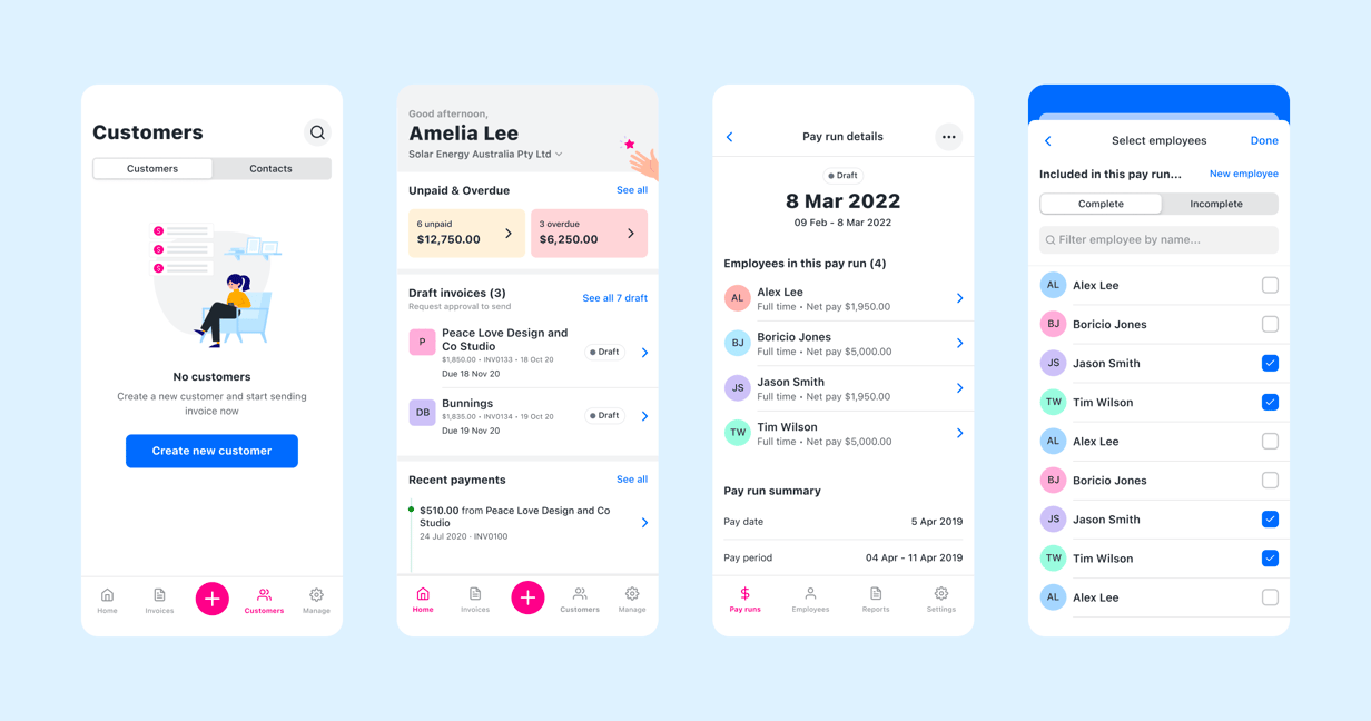
Highlights
- Established a new design team and design language across multiple brands and technologies
- Developed a mobile Design System (React Native) with two successful production apps shipped to date
- Led development of a shared GraphQL platform and schema for the front-end
- Developed a new web Design System as cornerstone of a unified React front-end platform (Balance)
Thinkmill brought a fresh design perspective and a depth of experience that gives me the confidence to pursue a mobile product strategy – together.


Sam Allert
CEO, Reckon
Overview
We met the Reckon team just as they were embarking on the herculean task of building the next generation of their flagship products. First off the line was Reckon’s Single Touch Payroll App (STP App) – a new and entirely electronic way of reporting payroll, which the Australian Taxation Office (ATO) was about to mandate for every small business in Australia. The goal was to ship a mobile app that ensured business compliance, and use the opportunity to introduce a new and native Reckon product to a generation of businesses that are new to digital record-keeping.
Leading design and development, we shipped the app in just five months. It consistently received positive reviews (4.4 stars, at time of writing). In the process, we laid the foundations for a new Reckon Design Language, introduced GraphQL, prototyped workflows that focused on great Developer Experience (DX), and created a component library that set the tone for Reckon’s new UX direction.
In the months following launch, we produced a proof-of-concept for a new Design System and front-end platform, and we demonstrated the immense potential of further investment in engineering-led design. (opens in new tab) As a result, we got the backing of the leadership team and rolled up our collective sleeves.
Design Language Development
The next generation of Reckon products called for a new and fresh Reckon Design Language. With blessing from the top, we took a fairly radical early departure from the existing brand identity, and explored an entirely different aesthetic. This allowed us to establish new and exciting design foundations that have come to define the Reckon UX, while realigning with the brand through colour, illustration, and tone.
Thinkmill has been instrumental in shaping our design function. In fact I would say we have successfully implemented a design process that is uniquely Reckon’s, and that is succeeding in a very complex product environment.


Jason Hollis
General Manager of Product, Reckon
Guidelines, patterns, components

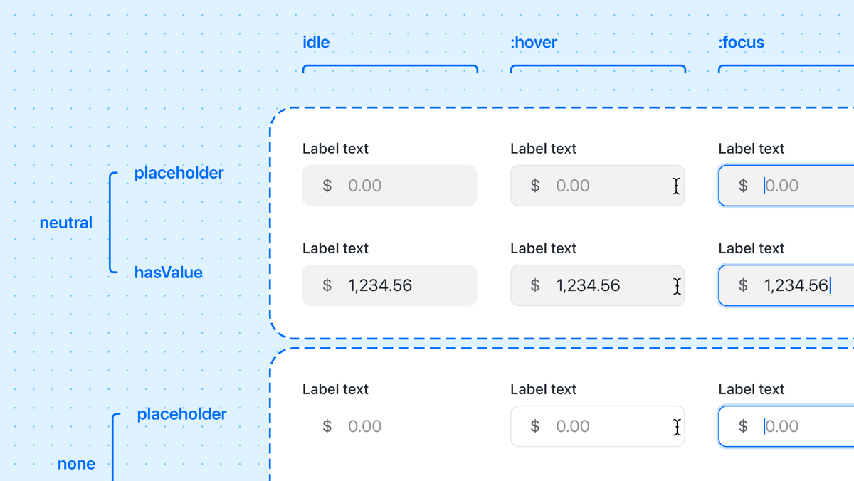
With both the capability and the mandate in place, we decided early on to create entirely bespoke components. To achieve our UX and DX goals simultaneously, we wanted to control every component API and produce only what we needed at each step. We developed common patterns (UI and workflows) across the ecosystem of apps, and set about rigorously documenting guidelines for making good decisions when using new Design System – the living expression of which is at balance.reckon.com (opens in new tab) .
Organisational change
“Design systems are about people.” We knew from the start that the biggest challenge would be the successful rollout and adoption of the new front-end platform and design system across the organisation.
With an incredible level of support from the leadership, we developed a transition plan and created dedicated Design and Design System teams, seeded by Thinkmill. These new squads formed vital bridges to product and engineering teams, doing a mix of design, development, advocacy, cheerleading, as well as embedded hands-on support for shipping products. Feedback at 3 and 6 months has been almost universally positive.
Outcomes
Reckon design language
Inspired by the clarity and focus of mobile interfaces, Balance is Reckon’s new design language. It’s bright and bold. Variable density is available at the component level, supporting a wide range of interface approaches – from the generous and airy, to the power-user dense.

Balance Design System
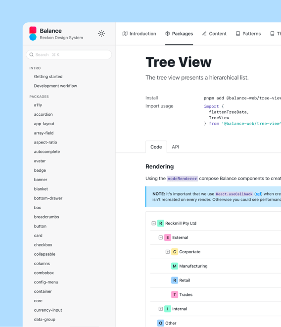
Over the period of some six months, we created a critical mass of made-to-measure components, patterns, and guidelines that underpin all new Reckon web apps. The living docs website is the first port of call for new users as a technical reference, as well as an important resource that helps align the entire product organisation.

First-class theming
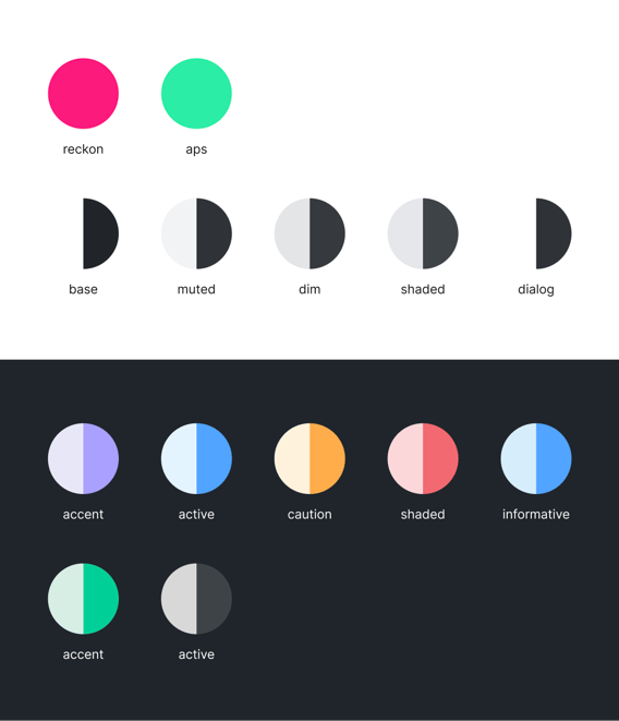
With several sub-brands under the Reckon umbrella, we developed a flexible theming system built on accessibility-focused colour functions and palette resolvers. Across modes and brands, theming provides flexibility: from brand differentiation, light/dark mode, and white labelling.

Balance Mobile
Balance Mobile, developed in React Native, is the mobile expression of Reckon’s new Design Language. The goal is the same: deliver the familiar and consistent Reckon user experience in every native mobile app. Balance Mobile is now the foundation for every mobile product on the roadmap.
We’d love to work with you
Have a chat with our team about how Thinkmill can support your software ambitions.
Contact us