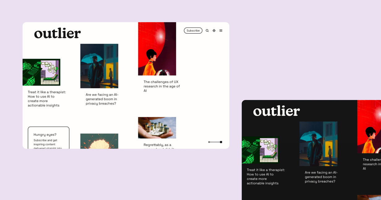
We helped Dovetail build and launch Outlier – a unique blog experience for sharing delightful product stories.
Dovetail designed a new content experience for product people that was more than just a website. We delivered their designs to a high standard while operating as a self-sufficient and self-managed engineering team.
Services provided
- Team Augmentation,
- React,
- Websites,
- Content Management Systems
Technology used
- Vercel


Highlights
- Implemented Spatial UI – a fluid content interface to enable a continuous reading experience that supports both dark and light modes
- Integrated the new blog with their existing stack to reduce adoption barriers for developers and content creators
- Created a custom media player with sound wave visualisation and minimalist controls
- Delivered an efficient content quoting and sharing feature for Twitter
Spatial UI – a fluid and continuous reading experience in dark & light modes
Dovetail’s Spatial UI design specification was created to provide a seamless reading experience across text, video, and audio content types. Implementing the subtleties of the design required technically complex front-end solutions. We delivered a highly immersive standard on web that’s typically only achievable with native tooling and devices.
A custom Media Player to align with Outlier’s Branded-content experience
The Spatial UI spec demanded a media player interface that looked and felt like a natural extension of the brand. We built a custom solution for video and audio playback with controls and waveform animations that feel at home in the interface.
A seamless content quoting and sharing feature for Twitter
The ability for readers to seamlessly share content without interrupting their reading flow was an important requirement of the project. We took sharing one step further with a Select & Share feature that lets readers post their favourite article excerpts directly to Twitter, and trims the selected content to the required tweet length.
Related case studies
Tiimely
We helped an award-winning home loan provider unveil their new brand with the launch of two websites.
Rugby
We helped Rugby Australia rebuild their publishing infrastructure with Keystone to power the content of 3000 websites.
Vocal
We helped Vocal scale from a hunch to a multi-million user publishing platform.


We’d love to work with you
Have a chat with one of our co-founders, Jed or Boris, about how Thinkmill can support your organisation’s software ambitions.
Contact us