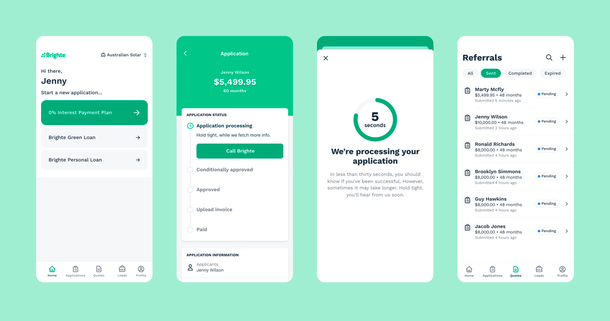
We helped Brighte create Spark – a Design System for Brighte’s Mobile Apps
Brighte set out to move their legacy mobile apps over to React Native. We helped them develop a Design System and ship a new Mobile App to improve their vendor partners’ user experience
Services provided
Tagged in


Highlights
- Shipped new Android & iOS apps for vendor partners
- Implemented a new React Native mobile design system to support the app
- Optimised the customer onboarding journey, halving the time it takes to apply for finance
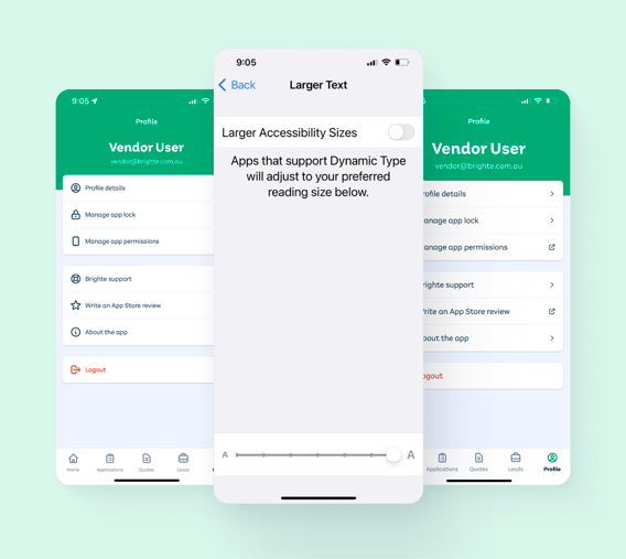
- Supported on-device accessibility features like VoiceOver and Dynamic Type
- Validated the new user experience via research interviews during design and closed beta releases
- Established a high-velocity delivery method within the mobile team
Halving the time it takes to apply for finance
Previously, applying for finance with Brighte took more than 12 minutes and 50 questions to complete. The new experience can be completed in as little as 5 mins and customers receive an outcome within 30 seconds.
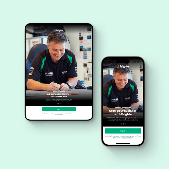
A mobile and tablet friendly experience across iOS and Android
Brighte’s partners are in the office, on the road, or out on site. Whether they use a mobile or tablet, or if it’s iOS or Android, all partners now get the same, great experience.


Partners made the app theirs with accessibility features
We took great care to support on-device accessibility features like VoiceOver and Dynamic Type. Brighte’s partners were able to fine-tune the reading experience for their context and put their customers at ease.


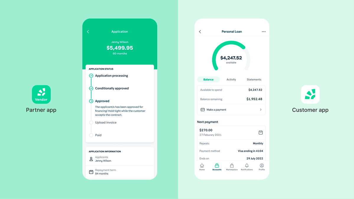
Equipped for a multi-platform, multi-product strategy
Brighte maintains two separate apps. One for partners, and another for customers. When we began work on the partner app, we consciously set out to not just design and develop the app but also create a mobile design system. Brighte’s mobile team is now equipped to refresh their customer experience without losing their newfound development velocity.


Related case studies
Reckon
We helped Reckon implement a unified front-end platform and design system.
DAFF
We helped an Australian Government department build a Design System to support their digital transformation goals.
ELMO
We helped ELMO build an award-winning design system to increase UX consistency and developer efficiency.
We’d love to work with you
Have a chat with our team about how Thinkmill can support your software ambitions.
Contact us