Interaction design with Edge Animate
Update: this post is now a couple of years old. Tools for prototyping UI animation have (happily) improved greatly since I wrote this, and certainly Edge Animate and PhoneGap belong more in 2014 than 2017. FWIW Sketch + Flinto is my current preferred pairing. Happy reading.

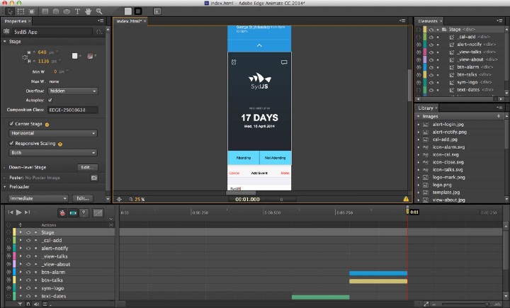
As an interaction designer who is more comfortable with pixels than code, I use Animate to quickly turn sketches and Photoshop comps into interactive and animated UI prototypes that run as “native” apps on mobile devices.
Below is my process for designing the interactions and animations for a simple app–for SydJS, a local JavaScript meetup–that allows members to confirm attendance, view upcoming talks, get reminders when meetups are scheduled, etc.
- Get the source PSD + Edge Animate composition
- Get the app source code (we open sourced everything)
The state of prototyping tools
- Flinto and InVision excel at quickly wireframing an app using only screenshots.
- Framer is a prototyping framework targeted at designers that can do basic JavaScript (CoffeeScript)
- Quartz Composer is Apple’s node editor for masochists (kidding) that was recently popularised by the Facebook Paper team. However it’s quite old, buggy and comes with a particularly steep learning curve (though it’s very powerful once mastered).
Edge Animate is in a kind of sweet spot at the moment. You can do most things visually, but if you’re also comfortable with basic JavaScript, you can make sophisticated interactions and take many shortcuts.
My object here is not to persuade you to use any one tool over another. In fact I strongly encourage you to try them all. Designing interactions and animations for user interfaces is a relatively young discipline and the ecosystem of tools is both very young and changing rapidly.
Edge Animate 101
Animate is the spiritual successor to Adobe’s Flash (complete with timeline, symbols and javascript) that outputs HTML5/CSS3/JS which can be quickly deployed as a native app using PhoneGap.
It’s not for making production-ready apps. But it is very useful for designing and prototyping app interactions and animations as an input into the development process.
If you’re entirely new to Edge Animate, I recommend you check out the getting started resources from Adobe and get familiar with the basics. There are a lot of great video tutorials to get you comfortable with the interface and basic concepts.
If you’ve used Flash before, you’ll feel right at home.
Timelines & Keyframes


Timelines and Keyframes are central to the composition.
At its most basic, a timeline is simply visualisation of changes in properties over time.
Keyframes define the “extremes” — the start and end values of properties, such as X/Y coordinates, opacity, etc. Together they are the buildng blocks of all animations.
Symbols
Think of symbols as encapsulated objects that have their own independent timeline. In our context, symbols typically represent interactions or views within an app. Symbols are particularly useful because they can be manipulated with user-triggered actions (eg. tapping a button causes a view to slide in from the bottom).

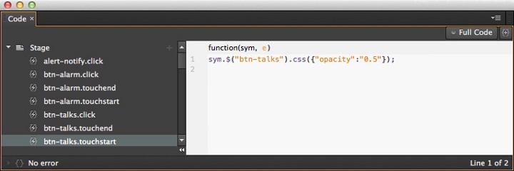
Triggers and Actions are what gives the composition interactivity. Triggers are events that exist on a timeline (e.g., at 500ms stop playback). Actions are usually user-triggered events (e.g., on touchstart, set opacity of element to 50%).
Part 1. Setting up
I prefer to get into Animate after a stint in Photoshop where I’ve designed the main views in the app and exported assets like icons and images.

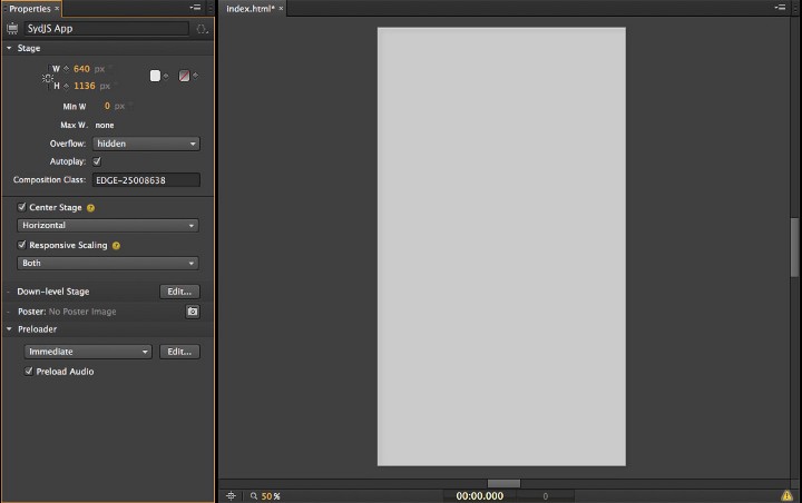
Nothing like a blank canvas. Here we’re setting up the composition dimensions to represent an iPhone 5 portrait view.
We’re prototyping for iOS here, so I’ve set the dimensions of the composition to 640 x 1136px for an iPhone 5.
There’s an amount of pre-planning that should go into the composition before you start. I’ll typically break up the comp into its primary views:
- Loading view (transitions to the Home screen)
- Home screen (w/ RSVP buttons, reminder prompt)
- Upcoming talks (overlay)
- About the meetup (overlay)
- With a mental map of how the comp will be organised, we can play.
Part 2. Animating
Home screen
Before adding actions and triggers that control interactions, I start by building the animations that I want to see and to get the timing right.
When the app starts up, I want a seamless and continuous transition from the initial loading screen that displays a static logo while the app is loading, to the main view where the user can begin using the app.
As the Home screen is loaded, I want to move and fade several UI elements into place. I start by laying out the ‘end’ view, then I work backwards, plotting keyframes on the timeline to define when and how I want elements to transition into view.
For example, the RSVP buttons slide it from the bottom, followed shortly by the buttons at the top of the UI.
Here’s the keyframe view, slowed down:
Even though the entire transition lasts less than ½ of one second, animating elements in, rather than simply making them appear, gives the interface a far more natural feeling. Remember that in the real world, few things appear before your eyes instantly.
RSVP buttons
The buttons in this composition are a little fancier than your average button. I want them to transition from their neutral state to a representation of the user’s RSVP.
Here’s what we’re doing here:
- Changing the relative width of the two buttons and their text label
- Changing the colour of the button to indicate state
- Hiding the unnecessary label and showing an ‘x’ in its place
- Showing the ‘add to calendar’ button (if attending)


The 5 states and 4 animations for our buttons
There are 5 states these buttons can be in, which gives us 4 sets of animations, like so:


There are “stop” points between each transition that represent the 5 button states from the previous image.
Next, we want to make sure the button labels animate with the button widths. The attending label will get wider, while the not attending label will be animated out of view. In its place we’ll fade in an ‘X’ to indicate that this area of the button will now cancel the previous action.
Rather than simply hiding the label and showing the ‘X’, we’ll tween the transitions with easing.
Avoid hard cuts as much as possible. In the real world, nothing ever appears
Avoid hard cuts as much as possible. In the real world, nothing ever appears
Part 3. Adding interactions
Triggers and Actions allow us to control the timeline based on predefined events and user input, which in turn adds interactivity to what would otherwise be a movie.
Depending on how interactive you want your app prototype to be, you can add as many or as few actions and triggers as you like.
I prefer to be conservative and add interactions only where necessary. The point of prototyping is to move rapidly and have the freedom to experiment broadly. Adding interactivity can quickly add unwanted overhead in the form of having to maintain an complex composition. Leave this to the development stage.
My rule of thumb is if it’s obvious what action precedes the animation, it doesn’t need to be made interactive. Save your efforts for other things.
Let’s look at the RSVP button interactions in detail.
The RSVP button interaction is encapsulated in a symbol with an independent timeline. We have 5 keyframes representing all the states that these buttons can be in. At each point we have a stop(); trigger.


At each of the marked points above, the trigger is simply sym.stop();

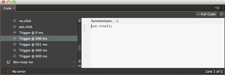
“After 200ms, stop playing the timeline”
Why? Because we want the animation to be paused between state changes until the user taps on the button again.
To achieve this, we’ll bind a “play” action to the “on-click” event for the button. It looks like this.

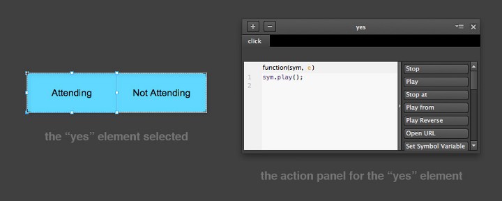
The action above simply causes the playhead in the symbol’s timeline to play, until it reaches the next “stop” trigger.
Remember: we’re working within the timeline of the symbol and not the main timeline, so this action is relative to this symbol. These actions are not affecting the main stage timeline.
We now have an interactive element that plays through a scripted timeline in response to a user action.
Hit ⌘+Return to preview the comp and interactions in the browser. When you’re ready to see how it feels in your hand, you can deploy it as a native app relatively quickly and easily.
Part 4. From Edge Animate to an App
This is the most valuable step and one of the main reasons I like Edge Animate. It’s one of the easiest methods for quickly bringing an idea to life with interactions and animations that you can install as a native app.
Interactive prototypes are a great test of the hidden assumptions in a design. You’ll quickly discover poor UX and conceptual gaps, which is the main reason this kind of prototyping is so useful.
Prototyping consistently creates better interaction designers as well as better apps.
You’ll need a PhoneGap account, and an Android and/or iOS developer account for the next part.
Prepare your composition and assets

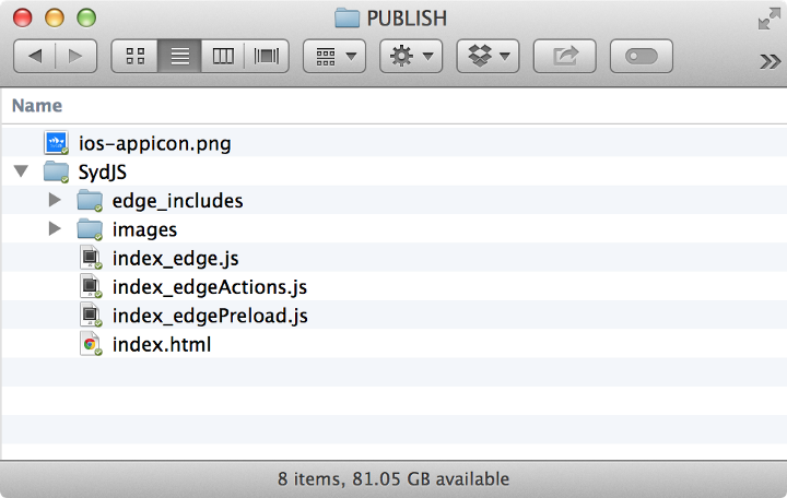
After you hit publish, you should have a folder that looks something like this:
First, your composition must be saved as index.html. This is what PhoneGap will look for at runtime. When you’ve saved your comp, use the Publish option to compile all the assets you need in PhoneGap.
Go ahead and compress the folder now. The zip file is what you’ll upload to PhoneGap in a minute.
Certificates & Keystores
This is the only tricky part of this process. Because we’re effectively creating a “real” app, we need to have our papers in order.
If you’re deploying to iOS, you’ll need a .p12 certificate and a provisioning profile. Check out the PhoneGap docs for help with this step.
If you’re deploying to Android, Lynda.com has a handy video tutorial
To create the .keystore file that you’ll need, plug this into your terminal window (replacing “app_name” with your app’s name):
keytool -genkey -v -keystore app_name.keystore -alias app_name -keyalg RSA -keysize 2048 -validity 10000
You should end up with a app_name.keystore file. Drag it into your folder above.

PhoneGap
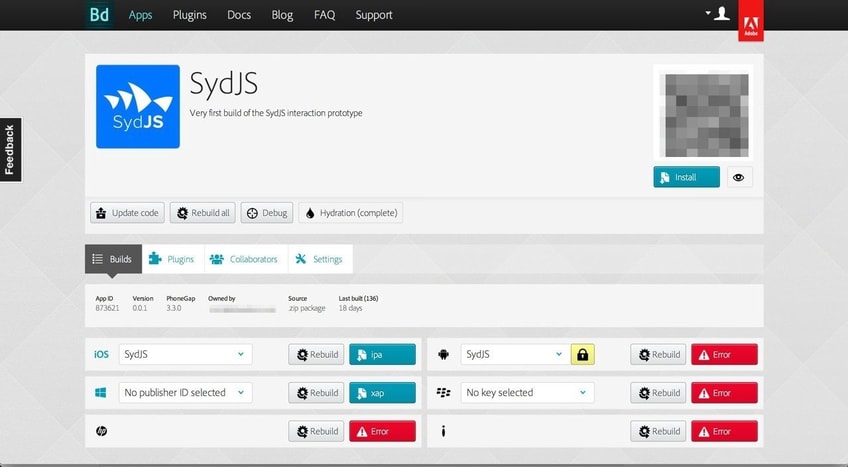
- Create a new app in PhoneGap. Install the .p12 certificate and then upload the .zip file you created above as the source. (If you’re building an Android app,follow these steps in the Lynda video)
- Enable hydration. This will check for a new build in PhoneGap every time you open the app on your device. A time saver when you deploy new builds. Upload an app icon. There’s no excuse not to with icon templates aplenty. Pro tip: don’t upload a rounded, transparent .png because you’ll get ugly edge ghosting in iOS. Upload a square icon and let iOS do the rounding for you.
- Install the app to your device by logging in to the PhoneGap website using your phone and simply hit the download button. If you’ve done it right, you should now see your Edge Animate comp installed as an app.
- Rinse & Repeat. As this will probably be the first time you get to touch your prototype, you’ll probably want to go back into Animate (or maybe even Photoshop) and start tweaking, iterating and redeploying. If you feel like you nailed it first go, you’re doing it wrong. I’ll typically go through this cycle ~20 times before I’m happy.
To deploy a new build of the app:
- Re-publish from Animate (don’t just hit ‘save’, use Publish)
- Zip the folder as before
- Upload new .zip to PhoneGap
- Relaunch your app
The hydra process should alert you to a new build and show you your latest version.
To wrap up
This is just one example of one process for prototyping animations and interactions for mobile apps. Edge Animate is one of the tools that suits my way of thinking and my skill set. (I’m learning JS so will play with Framerjs next). There’s no perfect tool for our discipline so open your mind and experiment until you find a tool (or two, or three) that suits you.
It’s a bloody exciting time to be an interaction designer!

