
As prototyping apps and tools become increasingly common, they are also becoming increasingly sophisticated. When I wrote the post about prototyping UI animation, Origami had just been released, Pixate was in early private beta (and not yet owned by Google), and you could still count the number of dedicated prototyping tools on one hand.
Now, there’s an abundance of tools to suit your approach.
All of these tools are good at some things. Many of them are excellent at lots of things, and in the right hands, add immense value to the design and development of an application.
I head up UX and Interaction design at thinkmill so I spend a good portion of my time translating ideas and concepts into interfaces and interactions. Over time the distinction between prototyping a solution vs. prototyping interactions has become very clear, and with it, the appreciation of which tools are best suit to each function.
While both solution and interaction prototyping are part of the broader design function, but they are not the same thing. They are complimentary but distinct, like designing the database schema is complimentary but distinct from architecting the system.
Why is the distinction important?
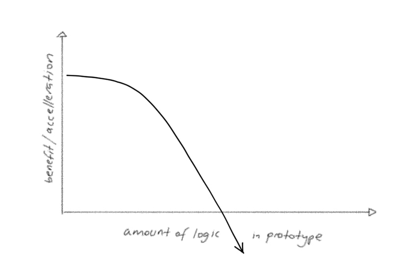
There’s nothing revelatory above, so why does it matter? With better tools, those of us who were previously restricted to paper sketches, Photoshop/Sketch and hand waving can get a little over-excited. It becomes tempting to attempt to prototype everything. However well intentioned, avoid the temptation. Diminishing returns kick in very quickly when prototyping.


The trick is to prototype the right things — the necessary things — rather than all the things.
The Solution Prototype
In the very early stages of a project, the first milestone is articulating a sane, high-level solution. Put another way, I’m trying to answer two questions:
- how could this system work?
- how could the user interact with this interface? q (Note could rather than should above. Assume you don’t know what anything should be like just yet).
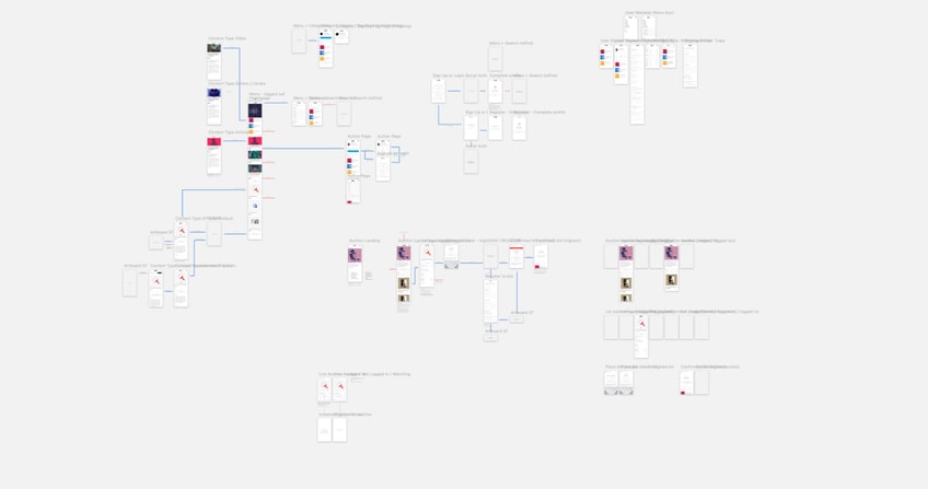
At this stage we’re trying to articulate a solution that doesn’t have glaring holes, and weed out obvious problems in the user experience. A solution prototype (as opposed to an interaction prototype) allows others to provide meaningful feedback with the benefit of a bird’s eye view.
I’ll use Sketch and Flinto to quickly stitch together static screens into a user flow, and sanity check the interface.
(Side note: I used to hand sketch on the iPad and then jump into Photoshop, but the Sketch workflow has made this step largely redundant — in case you need another reason to use Sketch).


It’s important to note that at this early stage, I’m not particularly concerned with optimising anything, only articulating the solution as completely as possible, based on limited information.
Parts that obviously don’t flow or make sense are quickly identified and fixed through iteration. With each iteration the prototype gets more refined and detailed (bot not very detailed yet) and comprehensive. Then, at some point, with enough iteration and feedback, I reach that magical point when I can run through the solution prototype and have it “hang together”
This is the time to switch gears and dive into interaction prototyping.
(I am, of course, over-simplifying here. There’s a ton of evaluation, testing and discussion of the solution prototype that goes on between these two stages).
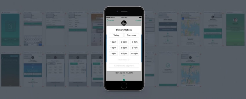
When the system architecture and information architecture hangs together well enough, I use interaction prototyping tools like Edge Animate and more recently Flinto for Mac, to develop the feel and flow of the interface. This happens in “spots”, meaning I’ll take the key views and view transition and visualise those particular interactions. For example:
To repeat the point above: do not try and build an app inside a prototyping tool. Worrying about managing application state while prototyping interactions is the worst kind of quicksand.
How do the tools compare?
While I could write a post for each — and others have done — here’s a few quick thoughts for now:
Solution Prototyping
Flinto / InVision / Marvel / …others
Actually, Sketch is the most useful solution prototyping tool, but in order to validate UX flow, Flinto is my personal preference here. Between dropbox integration that automatically updates screens as you export, scroll slices and the magic connector, it’s very fast to string together screens into a navigable interface. It’s bare bones otherwise as far as features go. There’s a handful of views transitions available and a neat preview. The fact that I can’t get fancier than navigating between screens is a good thing at this stage. I get to a “yep this works at a high level” point faster.
InVision has been around the longest (citation needed) and was a little late to the mobile prototyping game. I find the featureset richer, but the workflow slower. Marvel I’ve only recently started playing with and have little to say other than it seems nice.
Interaction Prototyping
Flinto for Mac / Edge Animate / Framer / Origami / …others
This field is a lot broader and your tool of choice will depend very much on how comfortable (or not) you are with writing code.
If you are familiar with JavaScript (erm, CoffeeScript specifically), there is arguably no better interaction design tool than Framer. It has very good Photoshop and Sketch integration and writing code means there’s little you can’t do. On the other hand, if you can’t or don’t want to code, it’s not for you.
I’ve written about working with Edge Animate in-depth previously. It’s an under-rated (un-cool) interaction design tool, and is all the more attractive because it caters to both comfortable coders and those who are not, with timeline-driven interactions. Gesture design can be harder to do compared to Framer, but that might not be a deal-breaker for you. Compositions can also easily be compiled into native apps using PhoneGap Build.
More recently, the folks at Flinto released Flinto for Mac. The most striking thing about it is that it’s not just a desktop client for web app, rather it’s a fully-fledged interaction design tool, with an excellent Export from Sketch plugin that preserves layers and groups from your Sketch files. I design with interaction in mind, so going from layer groups in Sketch to animatable layer groups in Flinto is a huge time saver. Perhaps most interestingly, there’s no concept of a timeline, as there is in just about every other tool. Instead you define a start and end states, and then control the delays + easing curves between the scenes. I’ll admit it took a while to wrap my head around the concept, but once I did, it makes a lot of sense.
(I discovered later that there are good tutorial videos explaining everything on Flinto’s site).
What about Origami? Origami is actually a patch library for Apple’s Quartz Composer node animation tool. Credit to the Facebook team, Origami makes Quartz Composer usable/useful and being a node animation tool there is no code or coding required — everything is point-and-click. When you wrap your head around the sequences of patches that are required to achieve an effect or design an interaction, it becomes a pretty powerful tool. On the other hand it is one of the most frustrating interfaces you’ll ever use. Changing values requires a double click on a tiny number field. To add a patch shortcut you must hover a mouse pointer precisely over a ~5px circle, lest it insert the patch in the wrong place. And Quartz Composer is such a resource hog that my MacBook Pro (i7, 16gb ram) spins its fans hard enough to reach low earth orbit. It’s not for me, but I suggest you try it for yourself in any case.
It feels like Origami / Quartz Composer proved that there is clear and present need for dedicated interaction prototyping tools, based on which a a new wave of tools has come into existence. Kudos for that. It’s certainly getting better every day.
Summary
- Understand the difference between prototyping a solution vs prototyping interactions within that solution
- Use the right tool for the job (you should use at least two different tools)
- Avoid the temptation to build a complete app in prototype — only build the important stuff
- Bonus point: try Origami and see if you can work out why anyone would.

